Domaine Karanika Holistic Rebranding – Packaging – Website
THE CONTEXT
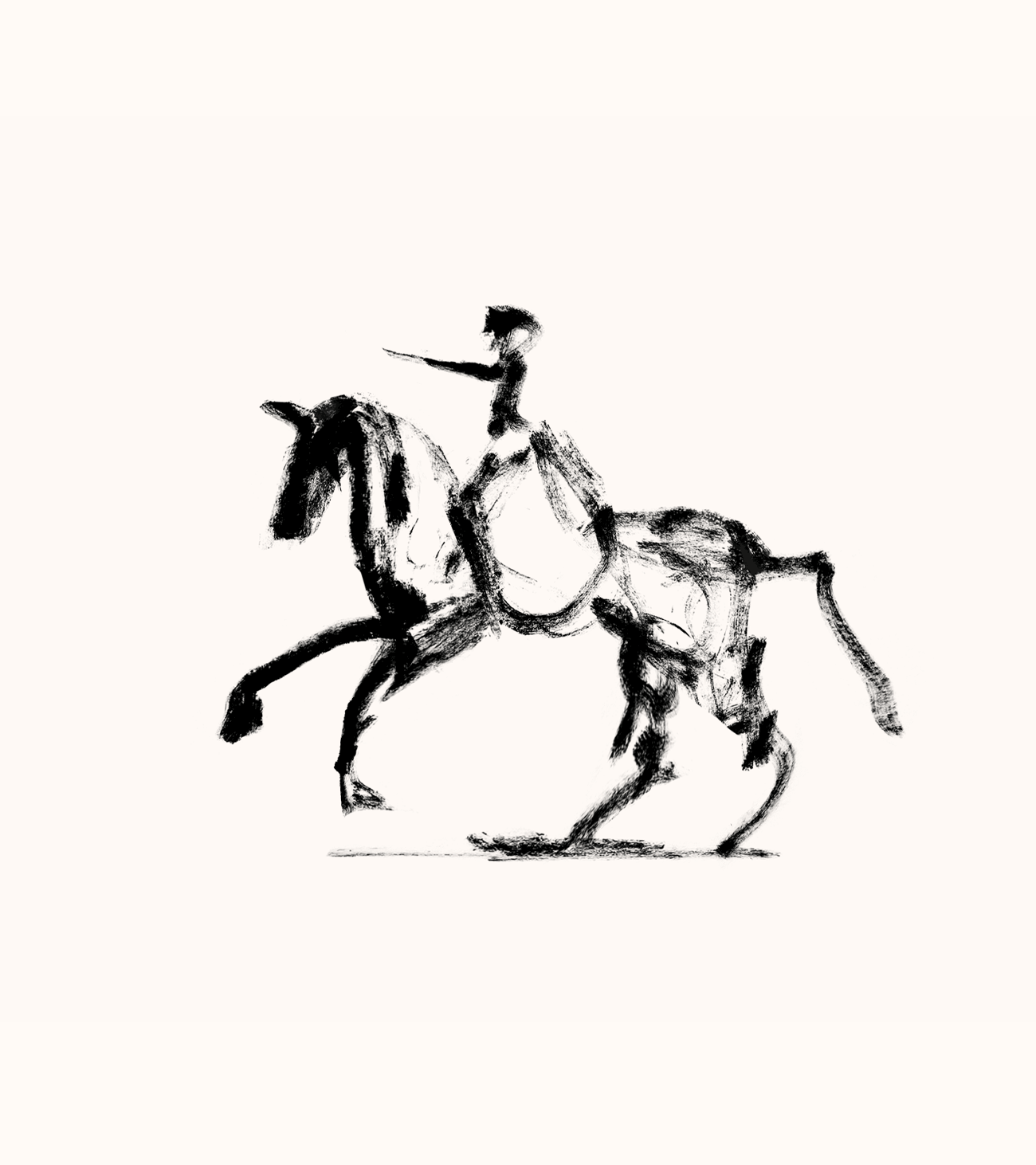
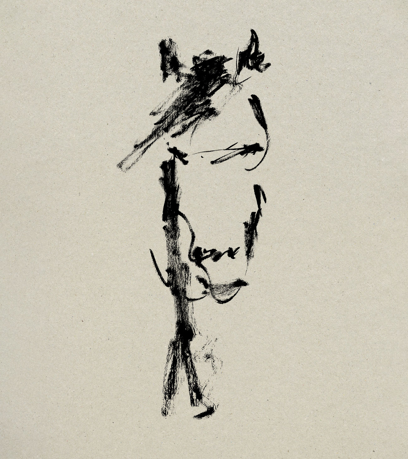
A day that has come to award us with everything that we expect and on the same time surprise us by offering unknown experiences. The creation of the highest quality sparkling wine whose success is based on a single ingredient. The absolute respect for Mother Nature. That the more respect we show, the more generously offers its goods. That was the exact vision of Laurens Hartman Karanika when he came back to his hometown, like a knight on his horse, mastering sparkling wine production. With respect. That’s how he presented himself to us. That’s how he inspired us. That’s how he won us. With respect.

THE CONCEPT
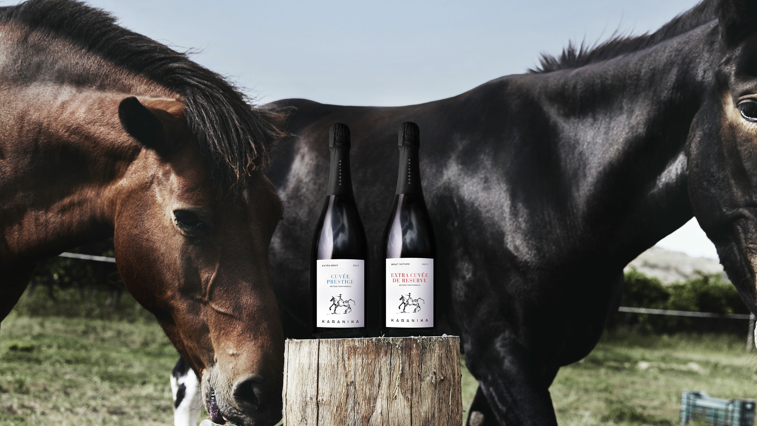
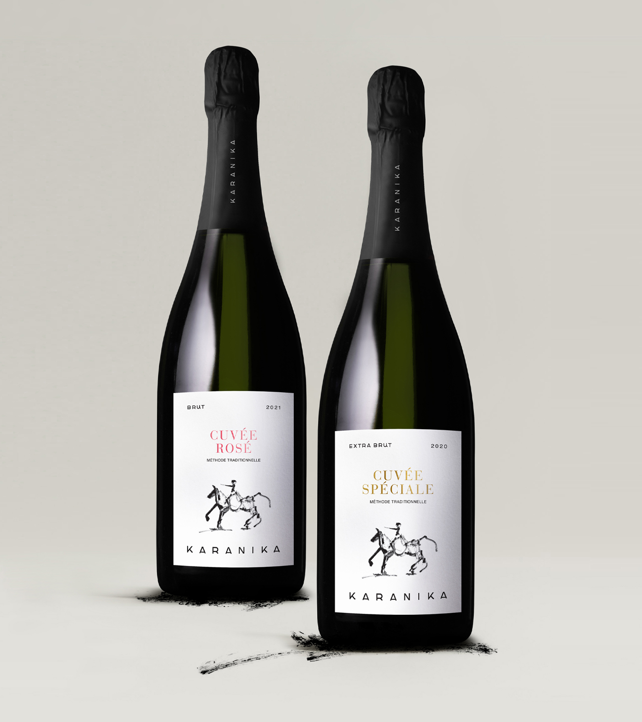
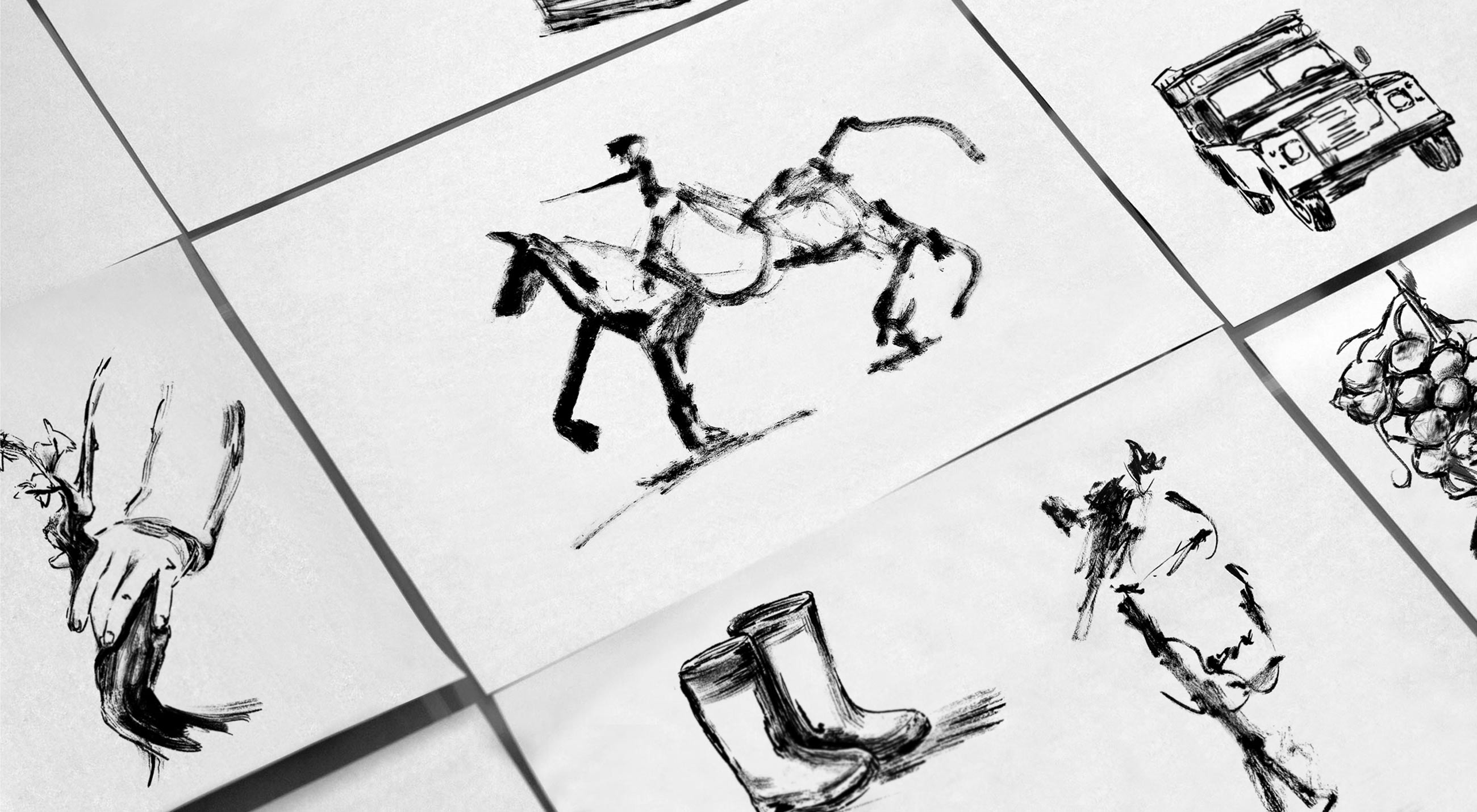
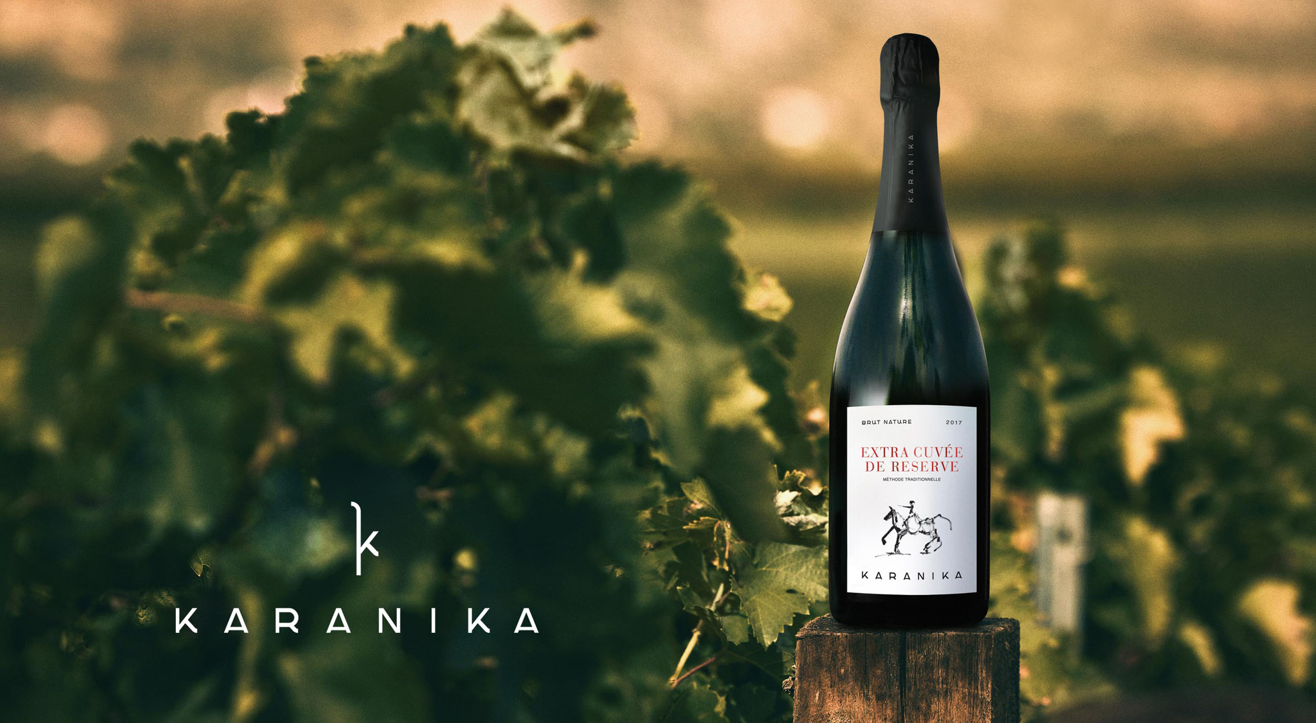
We took advantage of it, letting his story captivate and inspire us. By creating a new image for KARANIKA wines that harmonizes with his story. A hand-crafted knight naturally blends with gold, pink, blue, and red thermal printing, depending on the variety of the wine, offering a prestigious image to the new packaging design. A holistic new identity and a clear narrative pay homage to the KARANIKA vineyards and the creative mosaic that unfolds all the emotions that reflect the winemaking process.
Here’s to another day.
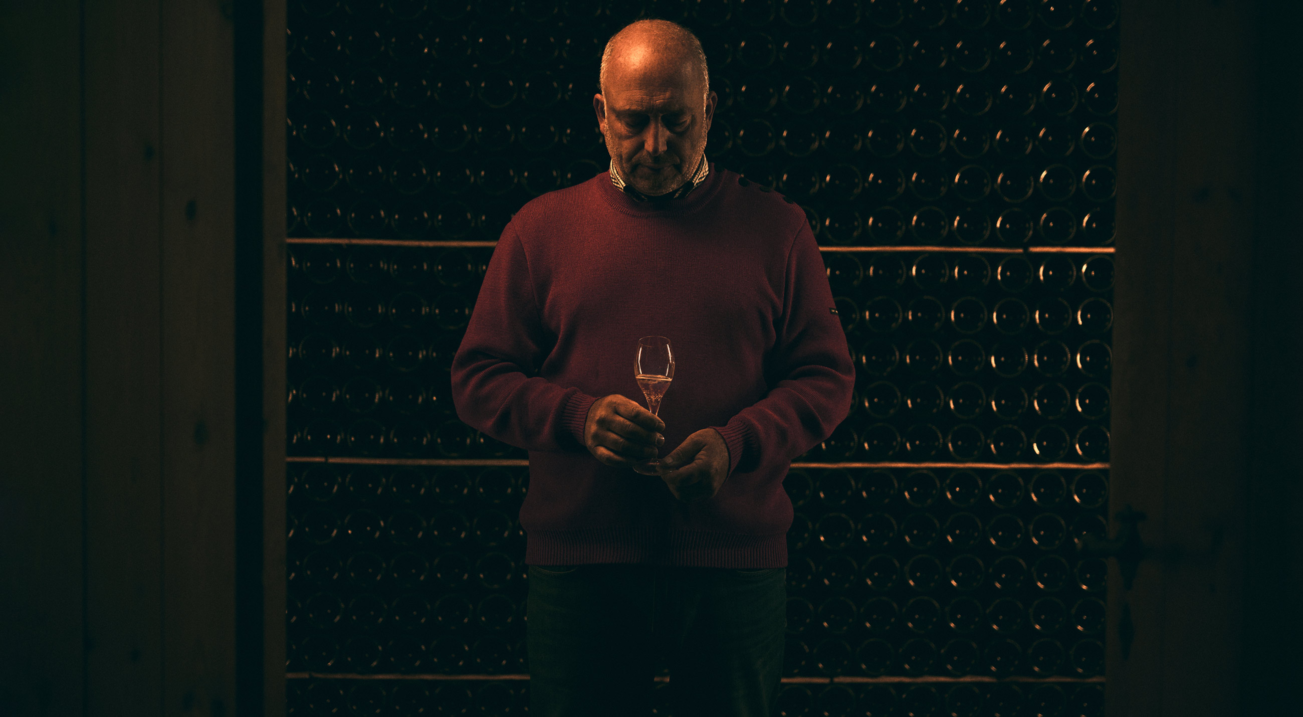


PHOTOGRAPHY: APOSTOLIS KOUKOUSAS
VIDEOGRAPHY / DIRECTOR GEORGE DASKALOPOULOS | THELAZERCOW